1. 문제 상황
증상: 스타일 파편화와 테마 전환 어려움
프로젝트가 커지면서 CSS가 점점 복잡해집니다:
/* 여기저기 흩어진 색상 값들 */
.header {
  background: #6366f1;  /* 기본 보라색 */
}

.button {
  background: #6366f1;  /* 같은 색... 맞나? */
}

.button:hover {
  background: #4f46e5;  /* 살짝 진한 보라색? */
}

.card {
  border-radius: 8px;
  box-shadow: 0 1px 3px rgba(0,0,0,0.1);
}

.another-card {
  border-radius: 6px;  /* 8px 아니었나? */
  box-shadow: 0 2px 4px rgba(0,0,0,0.15);  /* 그림자도 다름 */
}
문제점:
- 같은 값이 여러 곳에 하드코딩
- 다크 모드 추가 시 모든 색상을 개별 수정해야 함
- 일관성 없는 값들이 섞임
- 테마 전환 구현이 복잡해짐
목표
/* 한 곳에서 정의, 전체에서 사용 */
:root {
  --color-primary: #6366f1;
}

.header { background: var(--color-primary); }
.button { background: var(--color-primary); }

/* 다크 모드? 변수만 재정의하면 끝 */
[data-theme="dark"] {
  --color-primary: #818cf8;
}
2. CSS Custom Properties 기초
기본 문법
/* 변수 선언 */
:root {
  --변수명: 값;
}

/* 변수 사용 */
.selector {
  property: var(--변수명);
}

/* 폴백 값 (변수 없을 때 기본값) */
.selector {
  property: var(--변수명, 기본값);
}
간단한 예시
:root {
  --brand-color: #6366f1;
  --spacing-md: 16px;
}

.header {
  background: var(--brand-color);
  padding: var(--spacing-md);
}

/* 폴백 활용 */
.container {
  padding: var(--container-padding, 20px);
  /* --container-padding이 정의되지 않으면 20px 사용 */
}
:root는 무엇인가?
/* :root = HTML 문서의 최상위 요소 (<html>) */
/* 전역 변수를 선언할 때 사용 */
:root {
  --global-var: value;
}

/* html 선택자와 동일하지만 명시도(specificity)가 더 높음 */
SCSS 변수와의 차이
// SCSS 변수 (컴파일 타임에 치환됨)
$primary: #6366f1;
.btn { background: $primary; }
// 결과: .btn { background: #6366f1; }

// CSS 변수 (런타임에 동작)
:root { --primary: #6366f1; }
.btn { background: var(--primary); }
// 결과: .btn { background: var(--primary); }
// 브라우저가 실시간으로 해석
CSS 변수의 장점:
- 런타임에 JavaScript로 변경 가능
- 미디어 쿼리로 조건부 값 설정 가능
- 상속과 캐스케이딩 적용됨
- 빌드 도구 없이도 테마 전환 가능
3. 디자인 토큰 설계
토큰 분류 체계
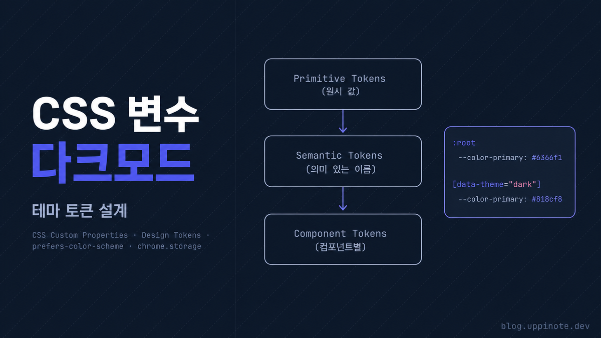
디자인 토큰은 계층 구조로 관리합니다:
Primitive Tokens (원시 값)
    └── Semantic Tokens (의미 있는 이름)
            └── Component Tokens (컴포넌트별)
3.1 색상 시스템
:root {
  /* ============================================
     Primary Colors (브랜드/액션 색상)
     ============================================ */
  --color-primary: #6366f1;
  --color-primary-hover: #4f46e5;
  --color-primary-dim: rgba(99, 102, 241, 0.15);

  /* ============================================
     Semantic Colors (의미 기반)
     ============================================ */
  --color-success: #10b981;
  --color-success-dim: rgba(16, 185, 129, 0.15);
  --color-warning: #f59e0b;
  --color-warning-dim: rgba(245, 158, 11, 0.15);
  --color-danger: #ef4444;
  --color-danger-dim: rgba(239, 68, 68, 0.15);

  /* ============================================
     Neutral Colors (배경, 텍스트, 테두리)
     ============================================ */
  --bg-primary: #ffffff;
  --bg-secondary: #f6f8fa;
  --bg-tertiary: #f3f4f6;
  --bg-hover: #e5e7eb;

  --text-primary: #24292f;
  --text-secondary: #57606a;
  --text-muted: #8b949e;
  --text-disabled: #c9d1d9;

  --border-default: #d0d7de;
  --border-muted: #e5e7eb;
}
3.2 스페이싱 시스템
:root {
  /* ============================================
     Spacing (4px 기준 배수)
     ============================================ */
  --space-1: 4px;     /* 아주 작은 간격 */
  --space-2: 8px;     /* 작은 간격 */
  --space-3: 12px;    /* 기본 간격 */
  --space-4: 16px;    /* 중간 간격 */
  --space-5: 20px;    /* 약간 큰 간격 */
  --space-6: 24px;    /* 큰 간격 */
  --space-8: 32px;    /* 섹션 간격 */
}
4px 기준 시스템의 장점:
- 대부분의 디스플레이가 4의 배수에 최적화
- 일관된 시각적 리듬 생성
- Tailwind, Material Design 등 주요 시스템과 호환
3.3 타이포그래피
:root {
  /* ============================================
     Typography
     ============================================ */
  --font-size-xs: 11px;
  --font-size-sm: 13px;
  --font-size-base: 14px;
  --font-size-lg: 16px;
  --font-size-xl: 18px;

  --font-weight-normal: 400;
  --font-weight-medium: 500;
  --font-weight-semibold: 600;
  --font-weight-bold: 700;

  --line-height-tight: 1.25;
  --line-height-normal: 1.5;
  --line-height-relaxed: 1.75;
}
3.4 기타 토큰
:root {
  /* Border Radius */
  --radius-sm: 4px;
  --radius-md: 6px;
  --radius-lg: 8px;
  --radius-xl: 12px;
  --radius-full: 9999px;

  /* Shadows */
  --shadow-sm: 0 1px 2px rgba(0, 0, 0, 0.05);
  --shadow-md: 0 4px 6px rgba(0, 0, 0, 0.1);
  --shadow-lg: 0 10px 15px rgba(0, 0, 0, 0.1);

  /* Transitions */
  --transition-fast: 150ms ease-out;
  --transition-base: 200ms ease-out;
  --transition-slow: 300ms cubic-bezier(0.4, 0, 0.2, 1);
}
4. 다크 모드 테마 설계
테마 변수 재정의
data-theme 속성으로 테마를 구분합니다:
/* ============================================
   Default: Light Theme
   ============================================ */
:root {
  /* 배경 */
  --bg-primary: #ffffff;
  --bg-secondary: #f6f8fa;
  --bg-tertiary: #f3f4f6;
  --bg-hover: #e5e7eb;

  /* 텍스트 */
  --text-primary: #24292f;
  --text-secondary: #57606a;
  --text-muted: #8b949e;

  /* 테두리 */
  --border-default: #d0d7de;
  --border-muted: #e5e7eb;

  /* 액센트 */
  --color-primary: #0969da;
  --color-primary-hover: #0550ae;
  --color-primary-dim: rgba(9, 105, 218, 0.1);

  /* 시맨틱 */
  --color-danger: #cf222e;
  --color-success: #1a7f37;

  /* 그림자 */
  --shadow-md: 0 4px 6px rgba(0, 0, 0, 0.1);
}

/* ============================================
   Dark Theme
   ============================================ */
[data-theme="dark"] {
  /* 배경 */
  --bg-primary: #0d1117;
  --bg-secondary: #161b22;
  --bg-tertiary: #21262d;
  --bg-hover: #30363d;

  /* 텍스트 */
  --text-primary: #e6edf3;
  --text-secondary: #8b949e;
  --text-muted: #6e7681;

  /* 테두리 */
  --border-default: #30363d;
  --border-muted: #21262d;

  /* 액센트 (다크 모드에서 더 밝게) */
  --color-primary: #58a6ff;
  --color-primary-hover: #79c0ff;
  --color-primary-dim: rgba(88, 166, 255, 0.15);

  /* 시맨틱 */
  --color-danger: #f85149;
  --color-success: #3fb950;

  /* 그림자 (더 강하게) */
  --shadow-md: 0 4px 12px rgba(0, 0, 0, 0.4);
}
컴포넌트에서 변수 사용
변수를 사용하면 테마 전환 시 자동으로 색상이 바뀝니다:
.card {
  background: var(--bg-secondary);
  border: 1px solid var(--border-default);
  border-radius: var(--radius-lg);
  padding: var(--space-4);
  box-shadow: var(--shadow-md);
}

.card-title {
  color: var(--text-primary);
  font-size: var(--font-size-lg);
  font-weight: var(--font-weight-semibold);
}

.card-description {
  color: var(--text-secondary);
  font-size: var(--font-size-sm);
}

.btn-primary {
  background: var(--color-primary);
  color: white;
  transition: background var(--transition-fast);
}

.btn-primary:hover {
  background: var(--color-primary-hover);
}
5. 시스템 설정 연동 (prefers-color-scheme)
CSS만으로 시스템 테마 감지
/* 기본값: 라이트 테마 */
:root {
  --bg-primary: #ffffff;
  --text-primary: #24292f;
  /* ... */
}

/* 시스템이 다크 모드일 때 자동 적용 */
@media (prefers-color-scheme: dark) {
  :root {
    --bg-primary: #0d1117;
    --text-primary: #e6edf3;
    /* ... */
  }
}
JavaScript로 시스템 설정 감지
// 현재 시스템 테마 확인
function getSystemTheme() {
  return window.matchMedia('(prefers-color-scheme: dark)').matches
    ? 'dark'
    : 'light';
}

// 시스템 테마 변경 감지
function watchSystemTheme(callback) {
  const mediaQuery = window.matchMedia('(prefers-color-scheme: dark)');

  mediaQuery.addEventListener('change', (e) => {
    callback(e.matches ? 'dark' : 'light');
  });
}

// 사용 예
watchSystemTheme((theme) => {
  console.log('시스템 테마 변경:', theme);
});
6. 사용자 선호 저장과 테마 전환
테마 관리 모듈
const THEME_KEY = 'userTheme';

// 테마 초기화
async function initTheme() {
  // 1. 저장된 사용자 선호 확인
  const saved = await chrome.storage.local.get([THEME_KEY]);

  if (saved[THEME_KEY]) {
    // 저장된 테마 적용
    setTheme(saved[THEME_KEY]);
  } else {
    // 시스템 설정 따르기
    setTheme(getSystemTheme());
  }
}

// 현재 시스템 테마 확인
function getSystemTheme() {
  return window.matchMedia('(prefers-color-scheme: dark)').matches
    ? 'dark'
    : 'light';
}

// 테마 설정
function setTheme(theme) {
  document.documentElement.setAttribute('data-theme', theme);
}

// 현재 테마 가져오기
function getCurrentTheme() {
  return document.documentElement.getAttribute('data-theme') || 'light';
}

// 테마 토글
async function toggleTheme() {
  const current = getCurrentTheme();
  const next = current === 'dark' ? 'light' : 'dark';

  setTheme(next);
  await chrome.storage.local.set({ [THEME_KEY]: next });

  return next;
}
테마 토글 버튼 UI
<button id="themeToggle" class="btn-icon" aria-label="테마 변경">
  <!-- 아이콘은 JS로 동적 생성 -->
</button>
const themeToggleBtn = document.getElementById('themeToggle');

// 아이콘 업데이트 (DOM API 사용)
function updateThemeIcon() {
  const isDark = getCurrentTheme() === 'dark';

  // 기존 아이콘 제거
  themeToggleBtn.textContent = '';

  // SVG 아이콘을 DOM API로 안전하게 생성
  const svg = document.createElementNS('http://www.w3.org/2000/svg', 'svg');
  svg.setAttribute('width', '20');
  svg.setAttribute('height', '20');
  svg.setAttribute('viewBox', '0 0 24 24');
  svg.setAttribute('fill', 'none');
  svg.setAttribute('stroke', 'currentColor');
  svg.setAttribute('stroke-width', '2');

  if (isDark) {
    // 해 아이콘 (다크 모드일 때 표시)
    const circle = document.createElementNS('http://www.w3.org/2000/svg', 'circle');
    circle.setAttribute('cx', '12');
    circle.setAttribute('cy', '12');
    circle.setAttribute('r', '5');
    svg.appendChild(circle);
    // 추가 라인들...
  } else {
    // 달 아이콘 (라이트 모드일 때 표시)
    const path = document.createElementNS('http://www.w3.org/2000/svg', 'path');
    path.setAttribute('d', 'M21 12.79A9 9 0 1 1 11.21 3 7 7 0 0 0 21 12.79z');
    svg.appendChild(path);
  }

  themeToggleBtn.appendChild(svg);
}

// 클릭 핸들러
themeToggleBtn.addEventListener('click', async () => {
  await toggleTheme();
  updateThemeIcon();
});

// 초기화
initTheme();
updateThemeIcon();
7. 페이지 간 테마 동기화
크롬 확장에서의 테마 동기화
여러 페이지 (popup, options 등)에서 테마를 동기화합니다:
// storage 변경 감지
chrome.storage.onChanged.addListener((changes, areaName) => {
  if (areaName === 'local' && changes[THEME_KEY]) {
    const newTheme = changes[THEME_KEY].newValue;
    setTheme(newTheme);
    updateThemeIcon();
  }
});
완전한 테마 모듈
// theme.js - 재사용 가능한 테마 모듈
const ThemeManager = {
  STORAGE_KEY: 'userTheme',

  async init() {
    // 저장된 테마 또는 시스템 테마 적용
    const saved = await chrome.storage.local.get([this.STORAGE_KEY]);
    const theme = saved[this.STORAGE_KEY] || this.getSystemTheme();
    this.apply(theme);

    // 스토리지 변경 감지 (다른 페이지에서 변경 시)
    chrome.storage.onChanged.addListener((changes, area) => {
      if (area === 'local' && changes[this.STORAGE_KEY]) {
        this.apply(changes[this.STORAGE_KEY].newValue);
      }
    });
  },

  getSystemTheme() {
    return window.matchMedia('(prefers-color-scheme: dark)').matches
      ? 'dark'
      : 'light';
  },

  getCurrent() {
    return document.documentElement.getAttribute('data-theme') || 'light';
  },

  apply(theme) {
    document.documentElement.setAttribute('data-theme', theme);
    // 커스텀 이벤트 발생 (UI 업데이트용)
    window.dispatchEvent(new CustomEvent('themechange', { detail: theme }));
  },

  async toggle() {
    const next = this.getCurrent() === 'dark' ? 'light' : 'dark';
    this.apply(next);
    await chrome.storage.local.set({ [this.STORAGE_KEY]: next });
    return next;
  },

  async reset() {
    // 시스템 설정으로 초기화
    await chrome.storage.local.remove(this.STORAGE_KEY);
    this.apply(this.getSystemTheme());
  }
};

// 사용
ThemeManager.init();

document.getElementById('themeToggle').addEventListener('click', () => {
  ThemeManager.toggle();
});

// 테마 변경 이벤트 리스닝
window.addEventListener('themechange', (e) => {
  console.log('테마 변경됨:', e.detail);
  updateThemeIcon(e.detail);
});
8. 실전 컴포넌트 예시
버튼 시스템
.btn {
  display: inline-flex;
  align-items: center;
  justify-content: center;
  gap: var(--space-2);
  padding: var(--space-2) var(--space-4);
  font-size: var(--font-size-sm);
  font-weight: var(--font-weight-medium);
  border-radius: var(--radius-md);
  border: 1px solid transparent;
  cursor: pointer;
  transition: all var(--transition-fast);
}

.btn:focus-visible {
  outline: 2px solid var(--color-primary);
  outline-offset: 2px;
}

.btn-primary {
  background: var(--color-primary);
  color: white;
}

.btn-primary:hover {
  background: var(--color-primary-hover);
}

.btn-secondary {
  background: var(--bg-secondary);
  color: var(--text-primary);
  border-color: var(--border-default);
}

.btn-secondary:hover {
  background: var(--bg-hover);
}

.btn-danger {
  background: transparent;
  color: var(--color-danger);
  border-color: var(--color-danger);
}

.btn-danger:hover {
  background: var(--color-danger);
  color: white;
}
카드 컴포넌트
.card {
  background: var(--bg-primary);
  border: 1px solid var(--border-default);
  border-radius: var(--radius-lg);
  padding: var(--space-4);
  box-shadow: var(--shadow-sm);
  transition: all var(--transition-base);
}

.card:hover {
  border-color: var(--color-primary);
  box-shadow: var(--shadow-md);
}

.card-header {
  display: flex;
  align-items: center;
  gap: var(--space-3);
  padding-bottom: var(--space-3);
  border-bottom: 1px solid var(--border-muted);
  margin-bottom: var(--space-3);
}

.card-title {
  font-size: var(--font-size-lg);
  font-weight: var(--font-weight-semibold);
  color: var(--text-primary);
}

.card-content {
  color: var(--text-secondary);
  font-size: var(--font-size-sm);
  line-height: var(--line-height-relaxed);
}
토글 스위치
.toggle {
  --toggle-width: 44px;
  --toggle-height: 24px;
  --toggle-padding: 2px;
  --toggle-thumb-size: calc(var(--toggle-height) - var(--toggle-padding) * 2);

  position: relative;
  display: inline-block;
  width: var(--toggle-width);
  height: var(--toggle-height);
}

.toggle input {
  opacity: 0;
  width: 0;
  height: 0;
}

.toggle-track {
  position: absolute;
  inset: 0;
  background: var(--bg-tertiary);
  border-radius: var(--radius-full);
  transition: background var(--transition-base);
}

.toggle-thumb {
  position: absolute;
  top: var(--toggle-padding);
  left: var(--toggle-padding);
  width: var(--toggle-thumb-size);
  height: var(--toggle-thumb-size);
  background: white;
  border-radius: 50%;
  box-shadow: var(--shadow-sm);
  transition: transform var(--transition-base);
}

.toggle input:checked + .toggle-track {
  background: var(--color-primary);
}

.toggle input:checked + .toggle-track .toggle-thumb {
  transform: translateX(calc(var(--toggle-width) - var(--toggle-thumb-size) - var(--toggle-padding) * 2));
}
9. 접근성 고려사항
색상 대비
WCAG 2.1 AA 기준: 텍스트는 최소 4.5:1 대비율 필요
:root {
  /* 흰색 배경(#fff) 기준 대비율 */
  --text-primary: #24292f;    /* 대비율 12.6:1 - AAA */
  --text-secondary: #57606a;  /* 대비율 7.0:1 - AAA */
  --text-muted: #8b949e;      /* 대비율 3.9:1 - 본문 부적합 */
}

[data-theme="dark"] {
  /* 어두운 배경(#0d1117) 기준 대비율 */
  --text-primary: #e6edf3;    /* 대비율 13.1:1 - AAA */
  --text-secondary: #8b949e;  /* 대비율 5.2:1 - AA */
  --text-muted: #6e7681;      /* 대비율 3.3:1 - 본문 부적합 */
}
Focus 상태
/* 키보드 네비게이션을 위한 명확한 포커스 표시 */
.btn:focus-visible {
  outline: 2px solid var(--color-primary);
  outline-offset: 2px;
}

/* :focus-visible vs :focus
   - :focus: 모든 포커스 (마우스 클릭 포함)
   - :focus-visible: 키보드 포커스만 */
애니메이션 축소 설정 존중
@media (prefers-reduced-motion: reduce) {
  *,
  *::before,
  *::after {
    animation-duration: 0.01ms !important;
    animation-iteration-count: 1 !important;
    transition-duration: 0.01ms !important;
  }
}
10. JavaScript로 CSS 변수 조작
변수 읽기/쓰기
// CSS 변수 읽기
function getCSSVariable(name) {
  return getComputedStyle(document.documentElement)
    .getPropertyValue(name)
    .trim();
}

const primaryColor = getCSSVariable('--color-primary');
console.log(primaryColor);  // "#6366f1"

// CSS 변수 쓰기
function setCSSVariable(name, value) {
  document.documentElement.style.setProperty(name, value);
}

setCSSVariable('--color-primary', '#8b5cf6');
동적 테마 커스터마이징
// 사용자가 선택한 액센트 색상 적용
async function setAccentColor(color) {
  setCSSVariable('--color-primary', color);

  // hover 색상 자동 계산 (약간 어둡게)
  const hoverColor = adjustBrightness(color, -15);
  setCSSVariable('--color-primary-hover', hoverColor);

  // 저장
  await chrome.storage.local.set({ accentColor: color });
}

// 밝기 조절 유틸리티
function adjustBrightness(hex, percent) {
  const num = parseInt(hex.replace('#', ''), 16);
  const amt = Math.round(2.55 * percent);
  const R = Math.max(0, Math.min(255, (num >> 16) + amt));
  const G = Math.max(0, Math.min(255, ((num >> 8) & 0x00FF) + amt));
  const B = Math.max(0, Math.min(255, (num & 0x0000FF) + amt));
  return `#${(1 << 24 | R << 16 | G << 8 | B).toString(16).slice(1)}`;
}
11. Before/After 비교
Before: 하드코딩된 스타일
.button {
  background: #6366f1;
  padding: 8px 16px;
  border-radius: 6px;
  transition: all 150ms ease;
}

.button:hover {
  background: #4f46e5;
}

/* 다크 모드? 모든 색상을 개별 오버라이드... */
@media (prefers-color-scheme: dark) {
  .button {
    background: #818cf8;
  }
  .button:hover {
    background: #a5b4fc;
  }
  .card {
    background: #1f2937;
    border-color: #374151;
    /* 모든 컴포넌트 반복... */
  }
}
After: CSS 변수 기반 디자인 토큰
.button {
  background: var(--color-primary);
  padding: var(--space-2) var(--space-4);
  border-radius: var(--radius-md);
  transition: all var(--transition-fast);
}

.button:hover {
  background: var(--color-primary-hover);
}

/* 다크 모드? 변수만 재정의하면 끝 */
[data-theme="dark"] {
  --color-primary: #818cf8;
  --color-primary-hover: #a5b4fc;
  --bg-primary: #0d1117;
  --border-default: #30363d;
  /* 모든 컴포넌트에 자동 적용! */
}
12. 베스트 프랙티스
DO (해야 할 것)
- 모든 색상, 간격, 크기를 변수로 정의
- 의미 있는 이름 사용 (
--color-dangernot--red) - 일관된 명명 규칙 (
--{category}-{name}) - 4px/8px 기준 스페이싱 시스템
- 호버/포커스 상태에도 변수 사용
- 테마별로 변수만 재정의
DON'T (하지 말아야 할 것)
- 색상값 직접 하드코딩
- 컴포넌트별로 다크 모드 스타일 개별 작성
- 의미 없는 이름 (
--var1,--color3) - 너무 많은 변수 (실제 사용하는 것만)
- 복잡한 calc() 중첩 남용
파일 구조 권장
styles/
  _variables.css     # CSS 변수 정의 (라이트/다크)
  _base.css          # 기본 요소 스타일
  _components.css    # 컴포넌트 스타일
  main.css           # 메인 파일 (@import)
또는 단일 파일에서 섹션으로 구분:
/* ============================================
   1. Design Tokens (Variables)
   ============================================ */

/* ============================================
   2. Dark Theme Overrides
   ============================================ */

/* ============================================
   3. Base Styles
   ============================================ */

/* ============================================
   4. Components
   ============================================ */
13. FAQ
Q: CSS 변수의 브라우저 지원은?
A: 모든 모던 브라우저에서 지원됩니다 (Chrome 49+, Firefox 31+, Safari 9.1+, Edge 15+). 크롬 확장이나 모던 웹 앱에서는 걱정할 필요 없습니다.
Q: 시스템 테마와 사용자 선택 중 어느 것이 우선?
A: 일반적으로 사용자 선택 > 시스템 설정 순서입니다. 사용자가 명시적으로 선택하면 그것을 존중하고, 선택하지 않았을 때만 시스템 설정을 따릅니다.
const savedTheme = await storage.get('theme');
const theme = savedTheme || getSystemTheme();
Q: 테마 전환 시 깜빡임(flash)이 발생해요
A: 페이지 로드 전에 테마를 적용해야 합니다. <head>에 인라인 스크립트를 추가하거나, CSS에서 기본 테마를 설정하세요.
<head>
  <script>
    // 가능한 빨리 테마 적용
    const theme = localStorage.getItem('theme') ||
      (matchMedia('(prefers-color-scheme: dark)').matches ? 'dark' : 'light');
    document.documentElement.setAttribute('data-theme', theme);
  </script>
</head>
Q: CSS 변수로 애니메이션 할 수 있나요?
A: CSS 변수 자체는 애니메이션되지 않지만, @property로 등록하면 가능합니다:
@property --progress {
  syntax: '<number>';
  inherits: false;
  initial-value: 0;
}

.progress-bar {
  --progress: 0;
  width: calc(var(--progress) * 100%);
  transition: --progress 500ms ease;
}
14. 참고 자료
- MDN: CSS Custom Properties
- MDN: prefers-color-scheme
- CSS-Tricks: A Complete Guide to Custom Properties
- Chrome Extension: Storage API
- WCAG 2.1 Contrast Requirements